MTA Website and Mobile App Redesign
Client: New York Metropolitan Transit Authority (MTA)
Introduction: The Metropolitan Transit Authority (MTA) is the major transit operator in New York City that operates the subway, commuter rails, and buses in New York City. The system consists of 16 commuter rail routes, 26 subway lines, and 322 bus routes. It carries 8.6 million passengers through its network every day, and it is the largest transit agency in the nation. For a transit agency of this scale, it is essential to have a clear website that allows passengers to find their information quickly, from ticket fares to navigation.
Problem: The MTA’s old website layout is everything but tidy and efficient. The design is a frustrating experience that takes a significant amount of time to navigate through the corresponding section just to find the right information.
This project seeks to overhaul the website and make it more approachable by restructuring the information hierarchy according to the passenger's needs. By studying the user's interaction and page flows extensively, the design aims to improve the user experience over the old website (desktop and mobile) and mobile app.
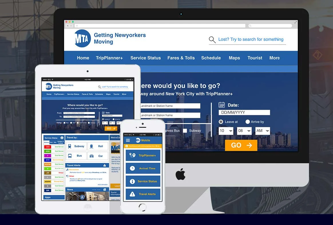
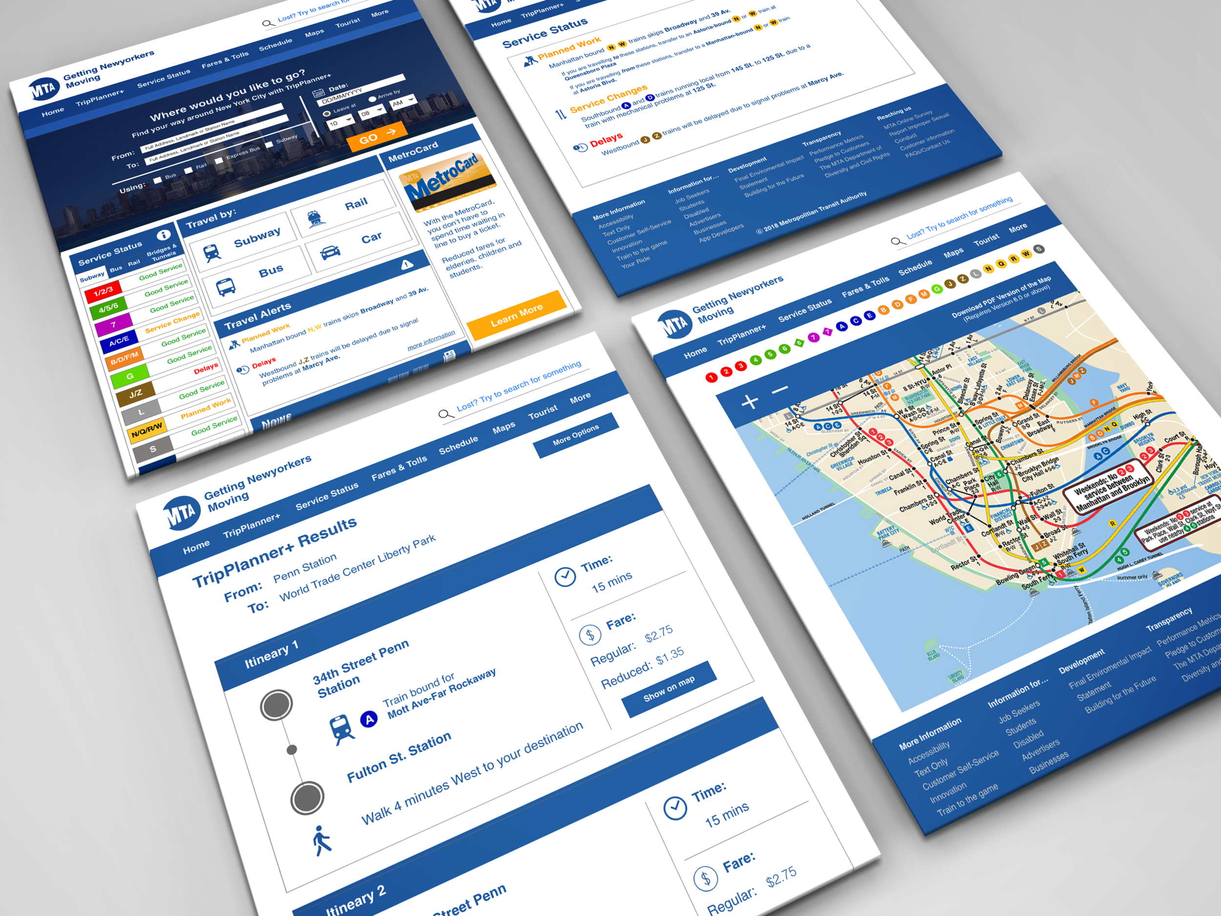
Solution: Overhauling the website layout to make the user find what they need, right where they need it. The modifications includes putting TripPlanner+ on the front page, as navigation is the first thing that most travelers look out for when they browse the site. Other overhauls include placing additional information such as travel alerts and planned works with great emphasis that are also important to the passengers.
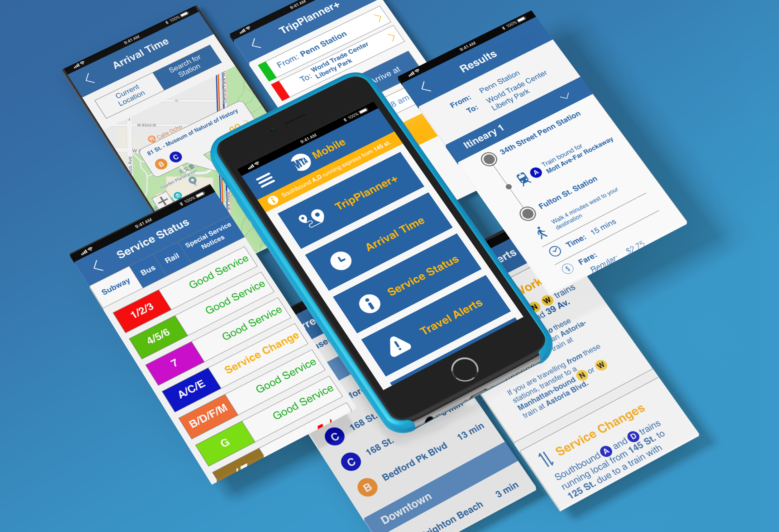
The mobile app also follows a similar principle, utilizing a grid layout for modularity to separate information and optimizing the layout for the small screen size on mobile.